
Booth Redesign
Organization: Newton Tree Conservancy
My role: Service / Industrial Designer (collaborated with 1 other Board Member)
Timeframe: 4 weeks
Summary
The Problem: The public kept asking us, what’s the difference between you and the Newton Conservancy? The tree applications had also declined since COVID (2020). Interested homeowners were unclear how, where, and when to apply for a tree planting.
HOW MIGHT WE BETTER ENGAGE OUR COMMUNITY BY CLARIFYING WHO WE ARE AND THE TREE PLANTING PROCESS?
Solution: I led the initiative to design and brand the interactive booth for community festivals.
More issues:
Community members always asked how we were different than Newton Conservators
Newton Tree logo is very small and color is washed out
Green colors of tent, banner and tablecloth do not match - bad representation of brand
Vertical picture frames kept falling over on windy day
Too much text for customers to read in 2-3minutes
Pamphlets are from 2010
and fall over in the wind
Foldable table and boxes are visible under tablecloth, which looks unfinished/unprofessional
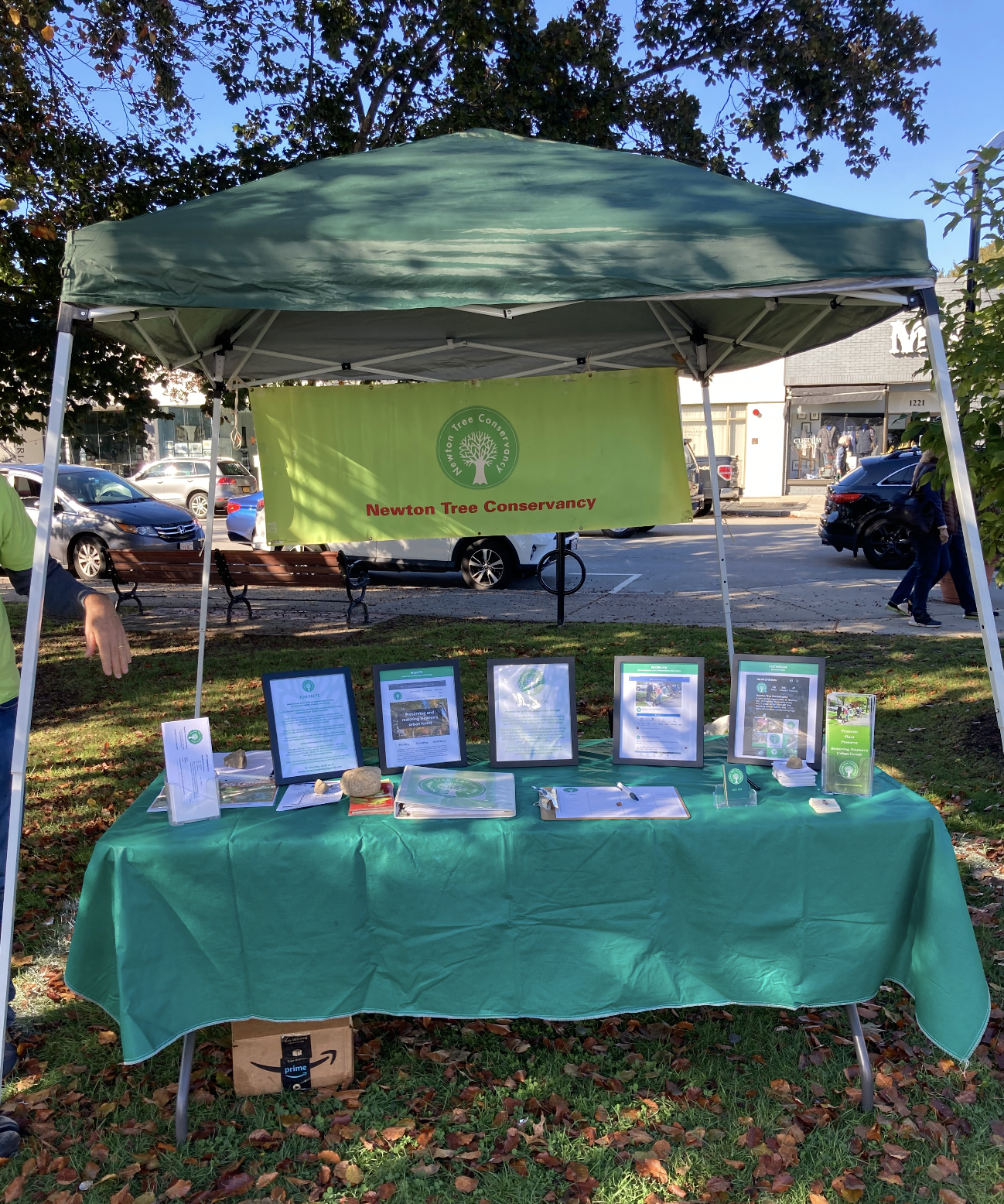
Define the Problem
The existing booth set up
Using community feedback and evaluative research, I audited our current booth set up and display products and found these issues:
First and foremost, the green tent literally broke shortly after this picture was taken!
No identifying name on tent
Banner has ripped edges, green color is fading
Red lettering is jolting against the neon green banner
Pamphlets are outdated, small, and not inviting
No website listed/visible!
No pictures showing what tree planting day is like!

Design
A picture is worth a thousand words!
I reviewed computer prototypes with the NTC Board of Directors for their feedback.
I made sure to include the name and website in very large, bold letters so people could easily identify our organization.
An awesome feature of this tent is this removable back wall.
The back wall is a photo collage of various action shots during actual planting days. Instead of Board members describing what we do on planting day, interested homeowners could SEE what actually happens on those very exciting days!
Design
Overall, the NTC Board LOVED the idea of photo collage on the back wall of the tent.
They also shared valid feedback:
- Shouldn’t include kids’ faces in pictures due to legal issue/minors
- All photos are at similar angle - add close up photos for more interest and more photos of trees.
<——————— Collage 1
Refined Collage ————————->


Prototype
I collaborated closely with our vendor to make sure all design details were laid out correctly on their company templates.


Final Booth Design
Harvest Festival Fall 2024
Major improvements:
Logo and website are visibly prominent.
Consistent branding visuals and colors.
Website and logo clearly visible.
Engaging materials, with accessible QR codes and action photos.
Booth interaction up 35%.
Logo and website are visibly prominent.
Clean and inviting colors and graphics.
Watering bag sample to show community what we use to water the newly planted trees.
Secondary storage area is clean and accessible.